#Persona #Infomation architecture #Competitive analysis #Customer journey #Wireframes
Yale School of Art Website Redesign
The Yale School of Art is the art school of Yale University (one of top Ivy League) where founded in 1869 as the first professional fine arts school in the United States. The school offer Masters of Fine arts degrees which is two-year course in graphic design, painting/printmaking, photography, or sculpture. The Yale School of Art is ranked # 2 of art school according to U.S. News in 2020.
Problem Statement
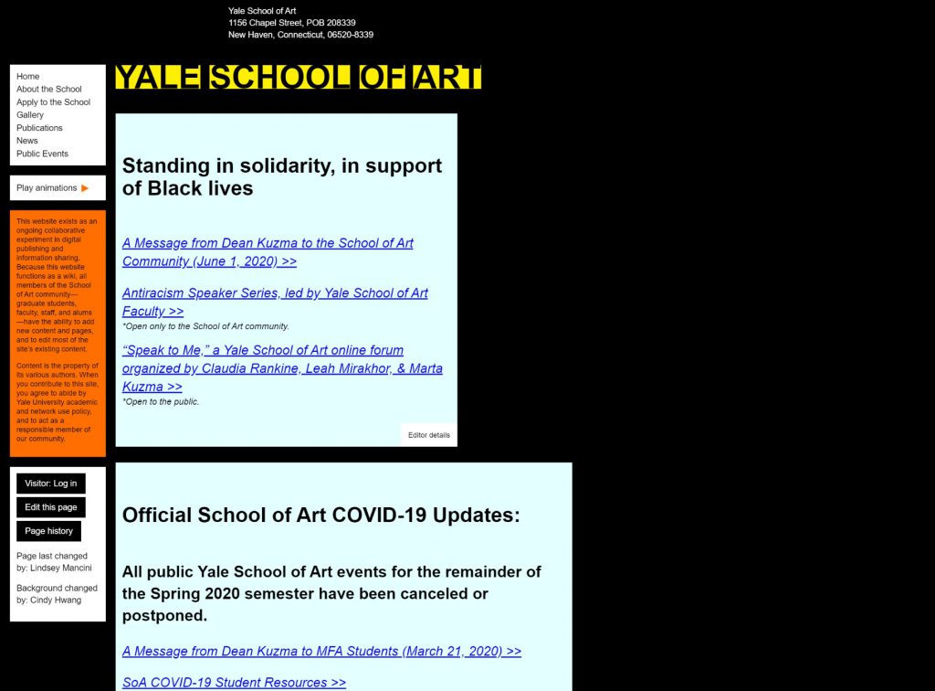
I analyzed baseline statistics and competitive analysis in order to find out strength and weakness. The website is very important tool for school to get application forms from students, however, the website of the Yale School of Art needs some improvements. The website is unique that anyone from the school can edit the contents. However, mobile site is not user-friendly and some parts need to be changed as well as desktop. SEO is strong because meta description is good.
Goals
Developer goals:
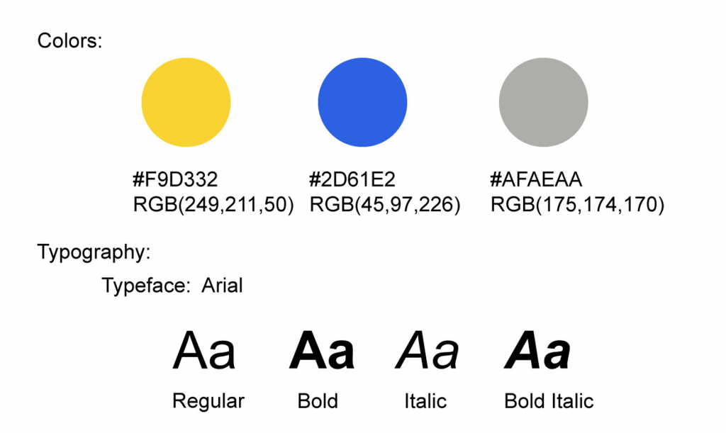
– Need to improve tone and manner to express brand image (color, font)
– Make the social media icons more visible by identifying on top of the page
– Remove or compress of images and video for lighten pages
– Need to optimize images for different screen sizes
– Need to improve size and space of tap targets such as links and buttons for more clickable
– Need to remove or update JavaScript library due to low security
Client goals:
– Increase number of applications for 15% by making call-to-action buttons high-visibility (application)
– Increase SNS followers by updating more contents and well-translation from website to SNS accounts
– Become No1. Art school in US by providing rich contents with user friendly and accessible website (successful career model, online events/materials, art DB etc.)
Users
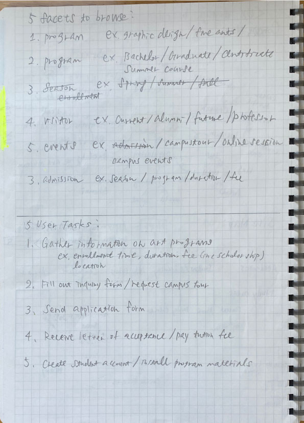
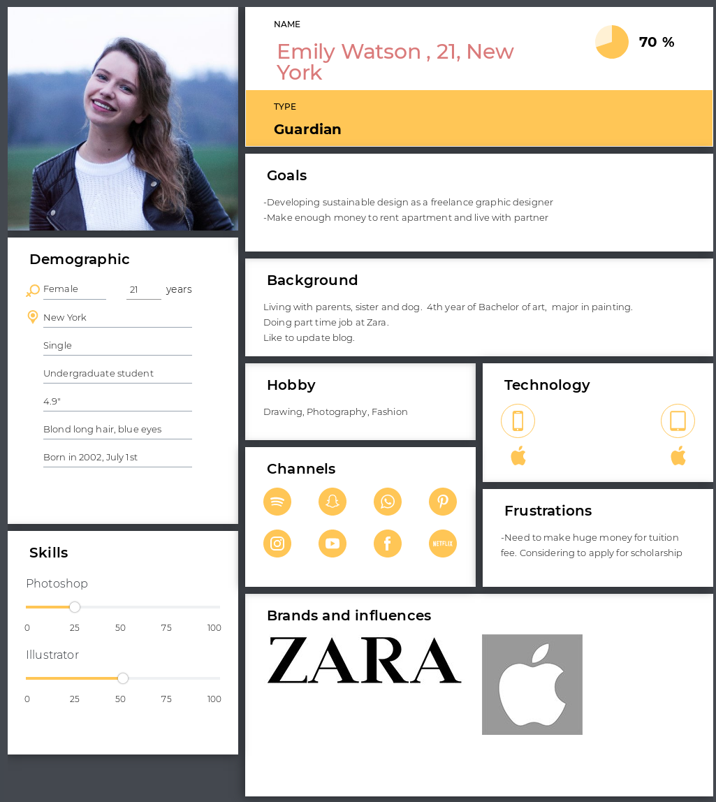
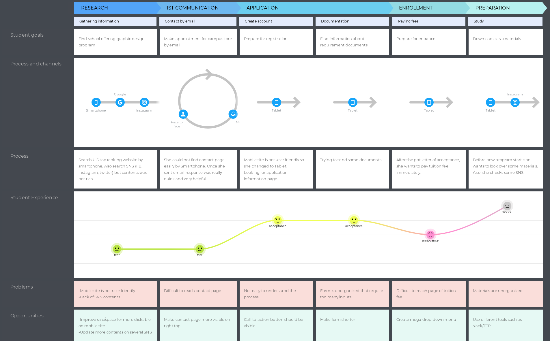
I set up persona and created user scenario and customer journey to understand customer experience. The problems and opportunities finding lead me to concern further process of information architecture.
persona 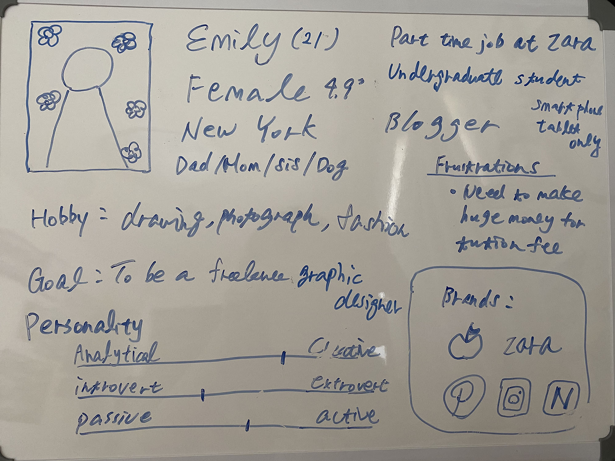
persona

Information architecture
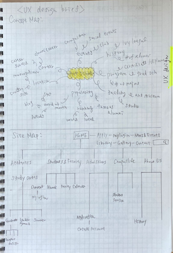
I made both original and revised sitemap that helped me to organize the structure and design wireframes. I used local navigation in order to make class more clear and enable to search efficiently.
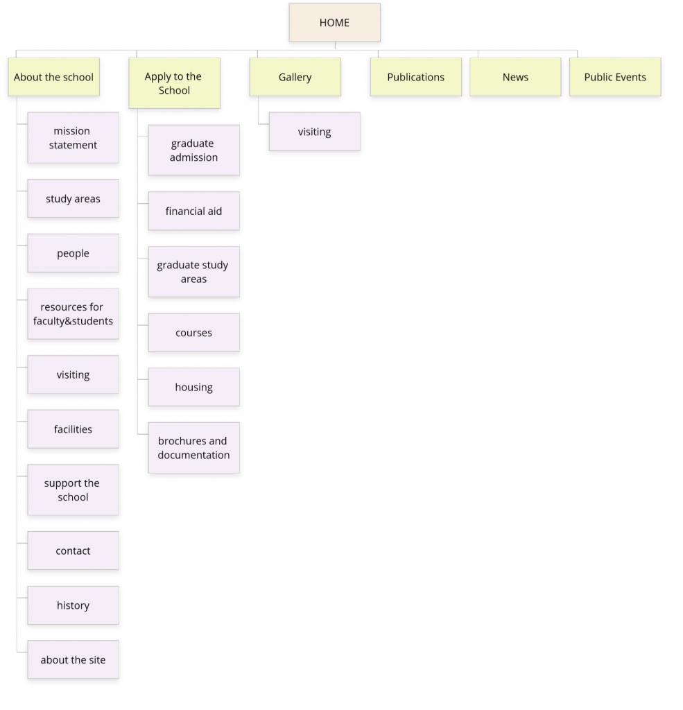
original 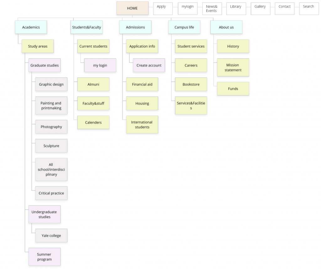
revised
Wireframes
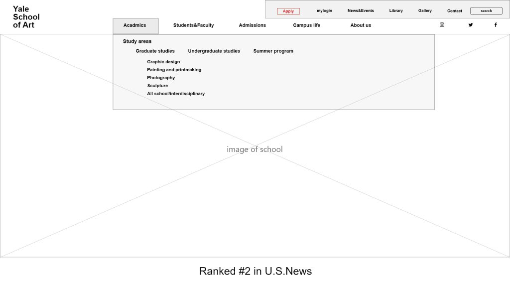
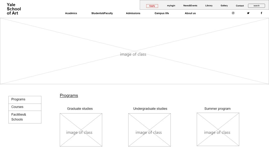
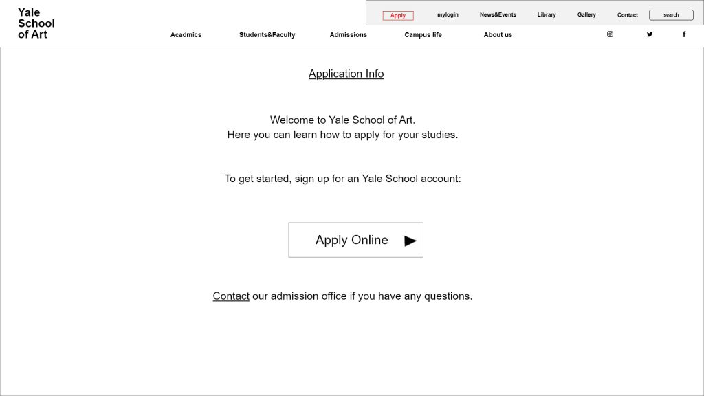
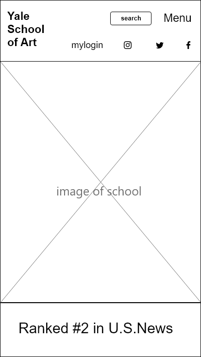
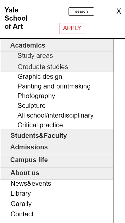
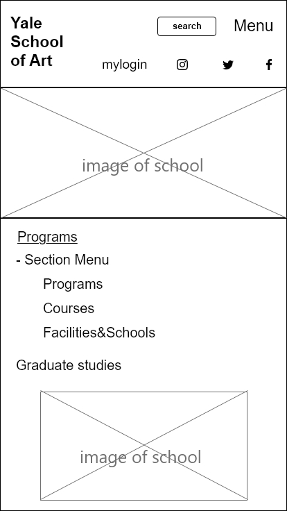
Based on the research and analysis, I created the wireframes for the desktop and mobile. I concerned usability and visibility for user and also added social media icon on the top so user can look further information.
Desktop
Mobile
Style guide
Selected the brand color of Yale School of Art.
